Case Study
Smartypantz,
Educational Toys
The Client
Our client is a brand new start-up company called Smartypantz. They produce educational toys for young children ages two to six. They are committed to only offering real, high quality products that offer an experience of fun and education combined. They came to us for a complete branding to help them come across in the market as the unique brand they are.
The Challenge
This project was a challenge from the start. We were aiming to present Smartypantz as a fun loving, exciting brand, yet, at the same time, come across as established, professional, and of course, educational.
The Result
We helped our client come across as a fun, exciting brand, thereby attracting their ideal clients. We collaborated to create and provide Smartypantz with a full visual branding, including a color palette, fonts, and of course, their very own logo.
The Brand
We kicked off the project with a research and discovery call, where we tried to get to the core of the brand, and understand what exactly the client was picturing.
We discovered that the client had the vision of a fun, exciting brand with lots of personality. Being that this brand really has a lot to offer, they did not want to come across as the average educational brand.
We managed to break down the brand to three main attributes:
This is an educational brand after all! We wanted to come across as established and proffesional.
At Smartypantz, the educational experience actually becomes exciting. We wanted this to come through in our branding.
The whole experience is characterized by joy and happiness as the child explores the world around them.
The Moodboard
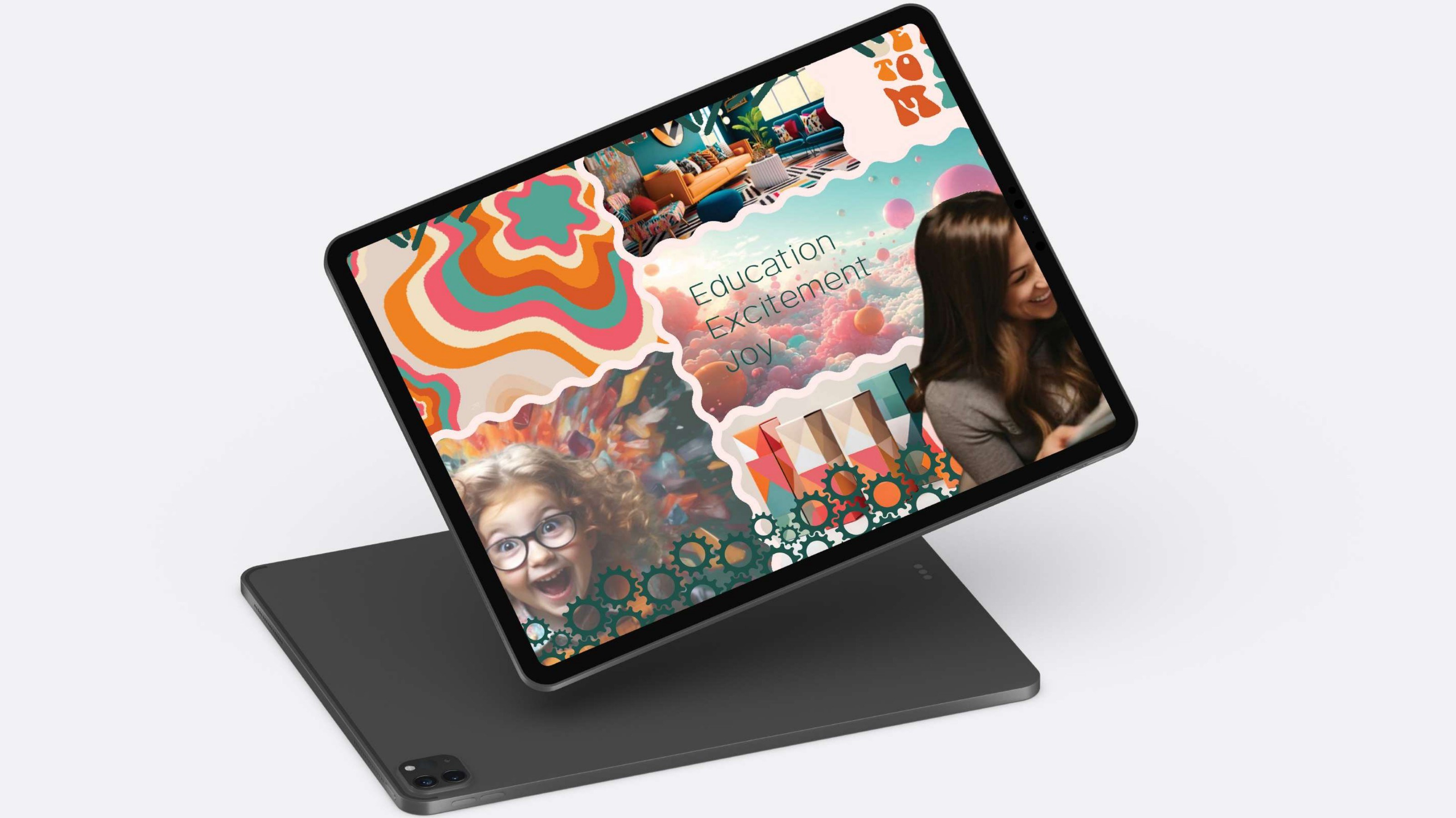
We then set out to create a moodboard, to see if we have properly captured the vibes and personality of the brand. The moodboard we created was a combination of the three brand attributes, but in visual form.
When presented with the moodboard, the client was blown away at how we managed to capture the essence of the brand so perfectly. We did subsequently choose to go with a different color palette, as the client preferred to go with more youthful colors.
Typography
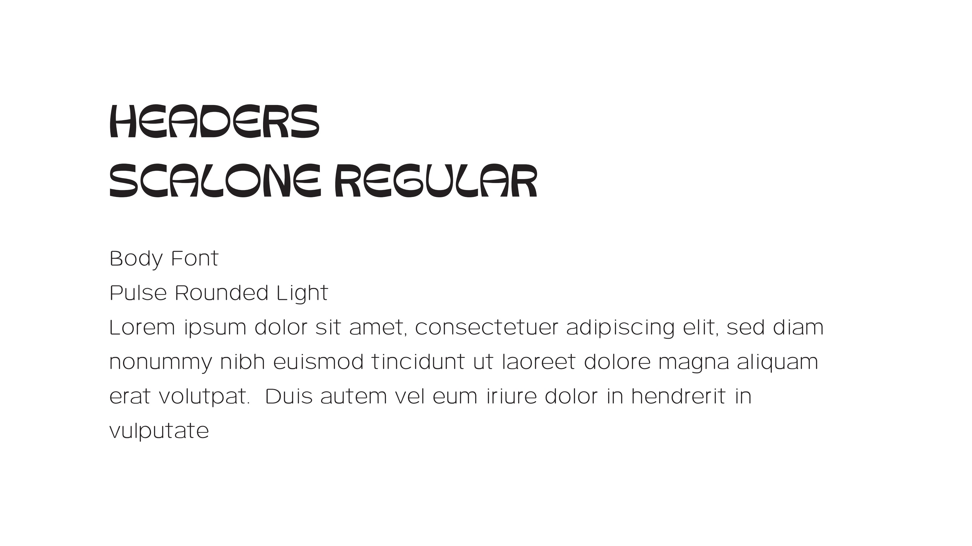
Both fonts we chose are quite rounded, because that gives off a friendly, playful vibe. We chose to go with the very funky, vibrant Scalone font as the header because it just screams out personality. We then chose the more modest, simple but still rounded font, Pulse Rounded Light, as the body font to properly balance out and contrast the header font.
Color Palette
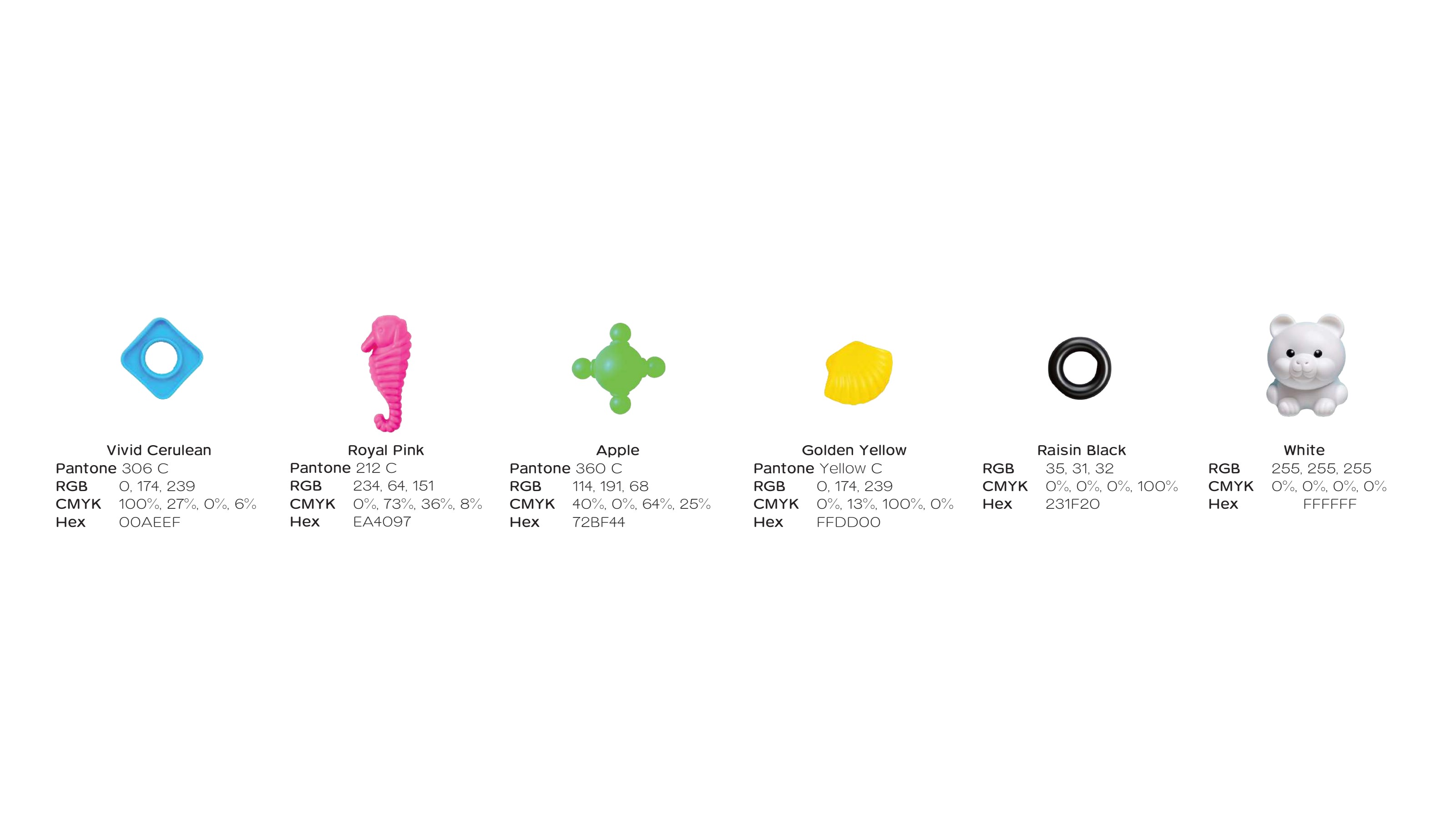
We went with a refreshing, vibrant and child-friendly color palette, as that is exactly the type of brand we are. The colors are also reminiscent of the primary colors, which is definitely education - like.
The Logo
The final logo has both exciting and educational elements. The multi-colored letters contribute to the excitement and child-friendly factor. We used sharp, geometric anges, reminiscent of school. We incorporated the glasses to add that touch of humor and personality. It also represents education. As a whole, we felt the logo really represents all that we would like it to represent.
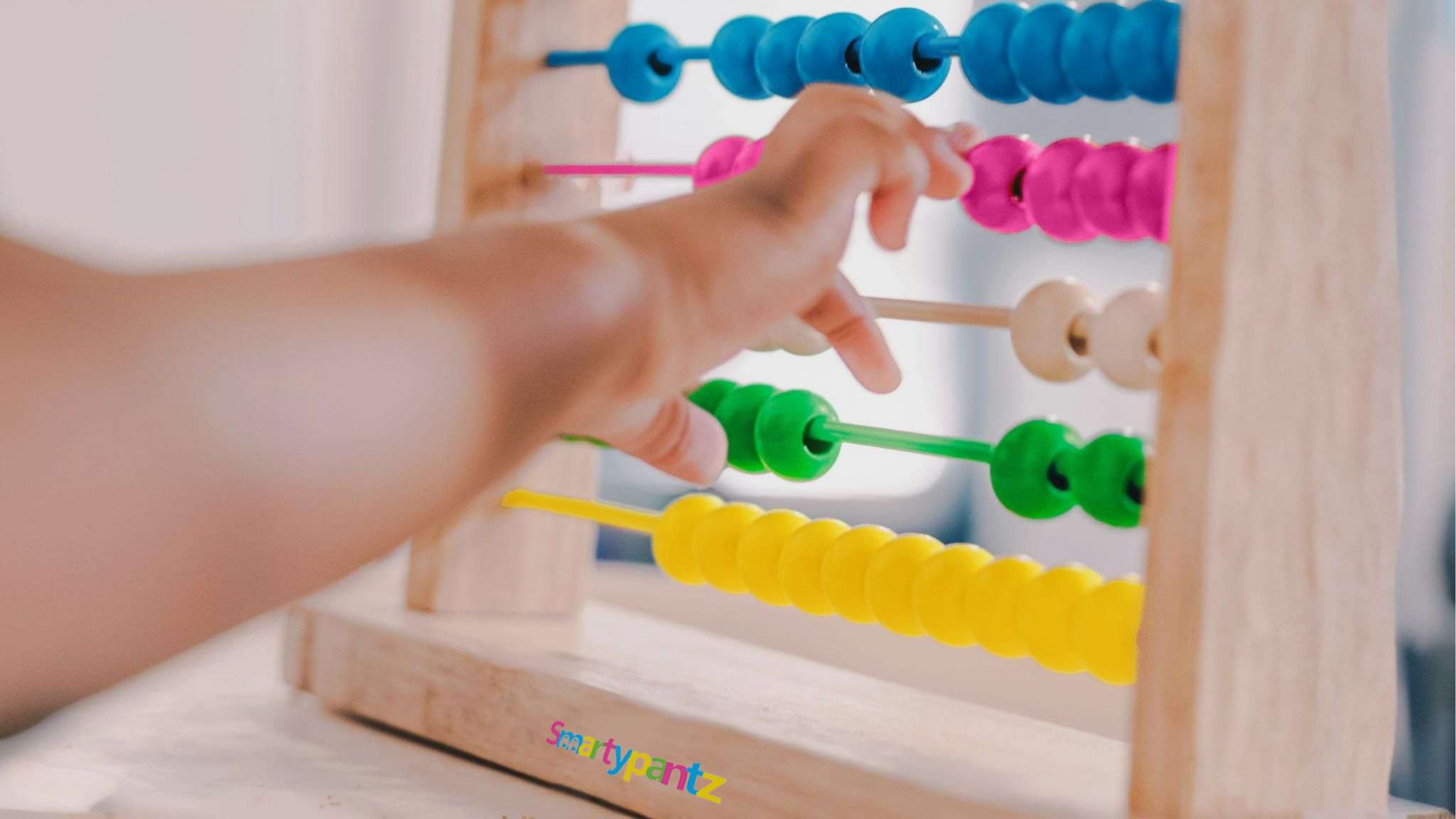
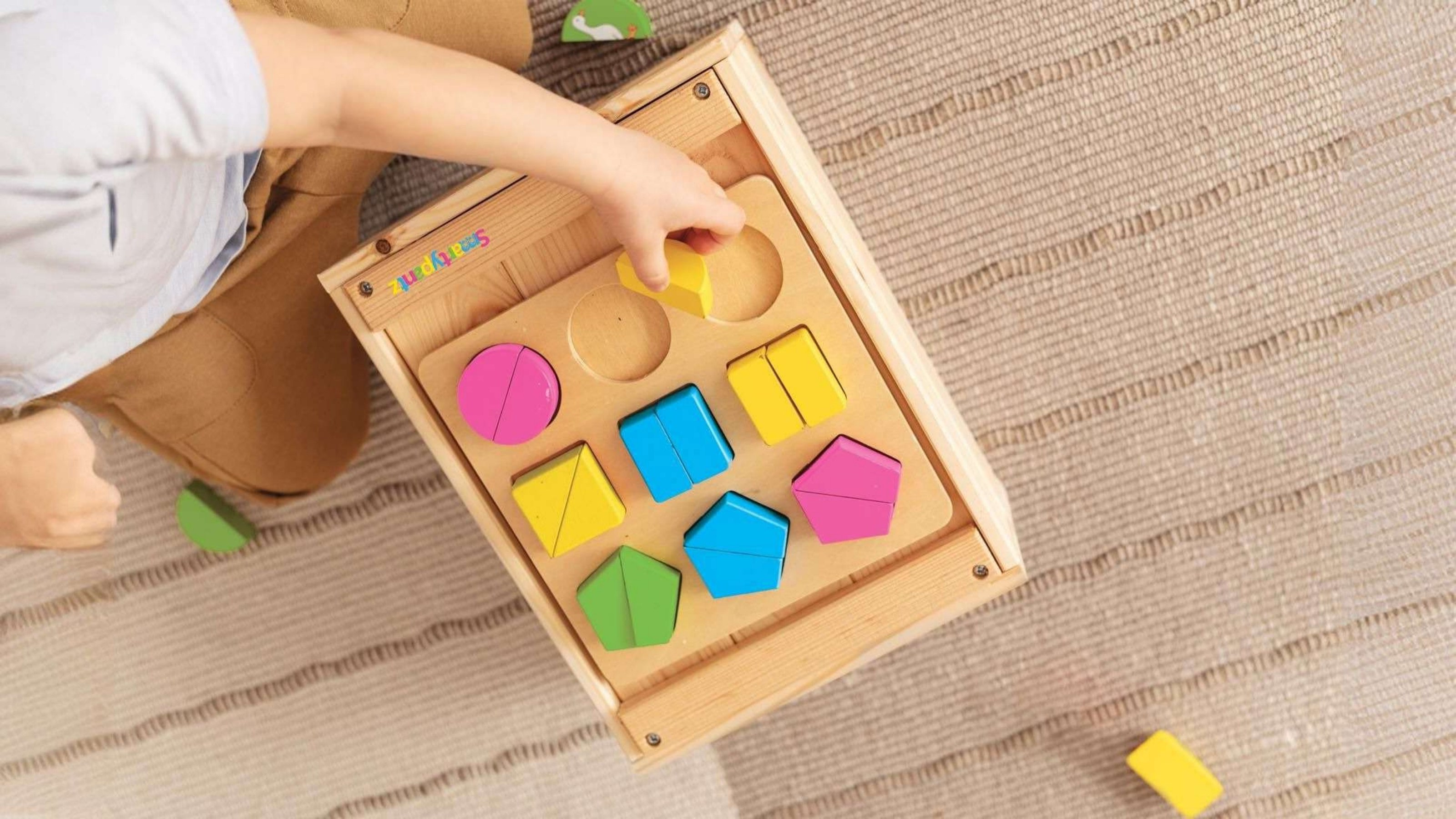
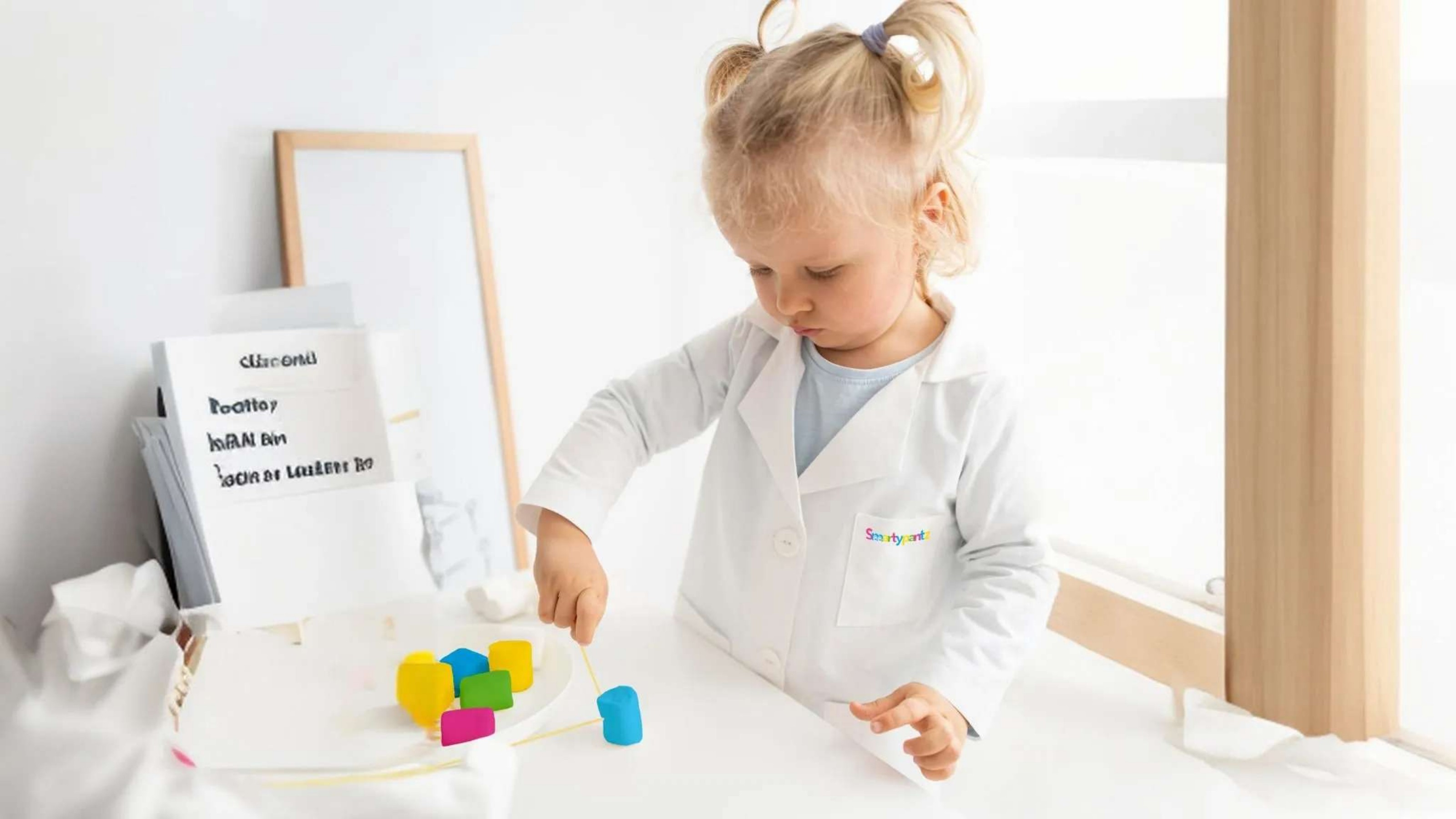
The Outcome
The client was thrilled with the final result. The new branding gave her a cohesive visual identity that's friendly, memorable, and ready to carry through to her first product packaging.
"It was an amazing experience working with Raizy."